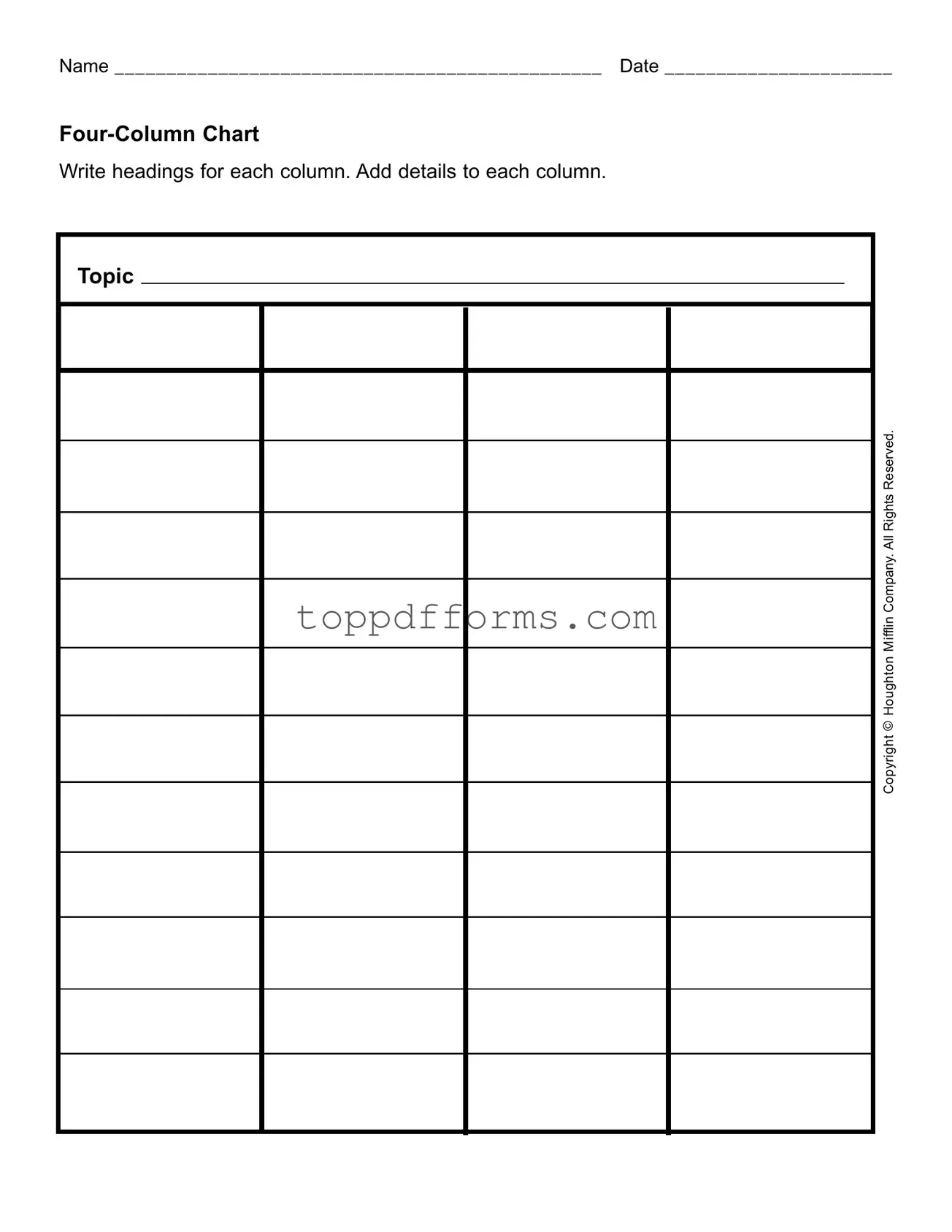
Free Four Column Chart Form
Things You Should Know About This Form
What is the purpose of the Four Column Chart form?
The Four Column Chart form is designed to help individuals organize information in a clear and structured way. By dividing details into four distinct columns, users can categorize and compare data effectively. This format is especially useful for brainstorming, project planning, or summarizing key points on a specific topic.
How do I fill out the Four Column Chart form?
To fill out the Four Column Chart form, start by writing a title or topic at the top. Then, label each of the four columns with headings that reflect the categories you want to explore. Next, add relevant details under each heading. This might include facts, ideas, or observations related to the topic. The process encourages thoughtful engagement with the material.
Can I customize the headings of the columns?
Absolutely! The headings of the columns can and should be customized to fit your specific needs. Whether you are working on a project, conducting research, or organizing thoughts, feel free to choose headings that make sense for the information you are compiling. This flexibility is one of the strengths of the Four Column Chart.
Is there a recommended way to use the Four Column Chart in group settings?
In group settings, the Four Column Chart can serve as a collaborative tool. Start by brainstorming the topic together and agree on the headings for each column. Then, as a group, populate the chart with ideas and details. This approach promotes discussion and ensures that multiple perspectives are considered, enriching the overall content of the chart.
What types of topics are best suited for a Four Column Chart?
The Four Column Chart can be used for a wide variety of topics. It is particularly effective for comparing pros and cons, analyzing different viewpoints, or summarizing research findings. Whether you are studying a historical event, planning a business strategy, or evaluating a book, this form can help clarify your thoughts and organize your findings.
Can the Four Column Chart be used digitally?
Yes, the Four Column Chart can be easily adapted for digital use. Many word processing programs or spreadsheet applications allow you to create a table with four columns, making it simple to input and manipulate data electronically. This digital format can also facilitate sharing and collaboration among team members.
Where can I find more resources or examples of using a Four Column Chart?
Many educational websites and resources provide examples and templates for using a Four Column Chart. You can find tutorials, sample charts, and even printable templates online. Additionally, libraries and educational institutions may offer guides on effective data organization techniques, including the use of charts like this one.
File Information
| Fact Name | Description | Governing Law | Notes |
|---|---|---|---|
| Purpose | The Four Column Chart is designed to organize information systematically. | N/A | Useful for comparing multiple topics or data points. |
| Structure | It consists of four distinct columns, each serving a specific function. | N/A | Flexibility allows for various uses across different fields. |
| Column Headings | Each column should have a clear and descriptive heading for clarity. | N/A | Headings guide users in understanding the data presented. |
| Application | Commonly used in business, education, and legal settings for analysis. | N/A | Facilitates decision-making processes. |
| Customization | The chart can be customized to fit specific needs or preferences. | N/A | Users can adjust the content and headings as necessary. |
| Collaboration | It promotes collaborative efforts by allowing multiple contributors. | N/A | Enhances teamwork in data analysis and reporting. |
| Accessibility | Can be created using various software tools, making it widely accessible. | N/A | Digital formats allow for easy sharing and editing. |
| Legal Use | In legal contexts, it may help in organizing case facts or evidence. | State-specific laws may govern evidence presentation. | Consult local regulations for compliance. |
| Visual Appeal | A well-designed chart can enhance understanding and retention of information. | N/A | Consider aesthetics to improve engagement. |
Common mistakes
Filling out the Four Column Chart form can be straightforward, but many individuals make common mistakes that can lead to confusion or incomplete submissions. One frequent error is failing to write a clear and concise heading for each column. Without appropriate headings, it becomes difficult for readers to understand the content organized within the chart.
Another mistake is neglecting to provide sufficient details in each column. Each section should be filled out with relevant information that accurately reflects the topic. If details are sparse or vague, the purpose of the chart may be lost, rendering it ineffective for its intended use.
People often overlook the importance of consistency in formatting. Using different font sizes, styles, or colors can create a disjointed appearance. Maintaining a uniform format throughout the chart not only enhances readability but also gives a professional touch to the document.
Additionally, some individuals forget to review their work for spelling and grammatical errors. Mistakes in language can undermine the credibility of the information presented. It is essential to proofread the content before finalizing the form.
Another common oversight is not aligning the columns properly. Misalignment can lead to confusion about which details belong in which section. Proper alignment ensures that the information is organized and easy to follow.
People also sometimes fail to include their name and date at the top of the form. This omission can create issues in tracking submissions and identifying authorship, especially in a collaborative environment.
Moreover, individuals may not utilize the space effectively. Some leave large gaps or fail to fill the columns adequately. Using the available space wisely allows for a more comprehensive presentation of information.
Lastly, a significant mistake is not understanding the purpose of the chart. Each section should reflect specific aspects of the topic being discussed. Without clarity on the chart's objective, the information may not serve its intended purpose.
Popular PDF Forms
U.S. Corporation Income Tax Return - Businesses can file the 1120 form by mail or electronically, depending on their preference.
Completing a Rental Application form is a crucial step in the renting process, as it not only showcases your qualifications as a potential tenant but also helps landlords assess various applicants effectively. For those looking to simplify this task, utilizing resources such as PDF Templates can streamline the process and ensure that all necessary information is accurately provided.
How Much Electricity Load Required for Home - Submission is often a prerequisite for obtaining necessary permits.